Bar Chart – Admissions Funnel

November 10, 2025

Comments

Horizontal bar chart titled “Enrollment Funnel” with four stages: Applicants (58k), Admits (39k), Accepts (58k), Enrolled (14k).
The Chart 

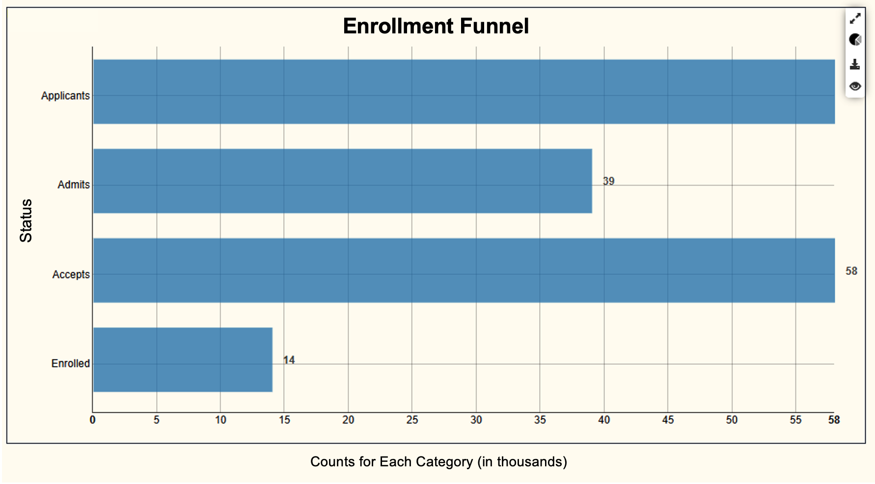
This is a horizontal bar chart that compares counts at each stage of the enrollment funnel. Bars make stage-by-stage gaps easy to scan and are more readable than a classic triangle “funnel.” Use it when you want to see absolute volume at each step and to discuss conversion between steps. Keep the axis at zero, order the stages in process order, and label units clearly (here, thousands). 

 
What It Answers 

Where is the biggest leak in our funnel right now, and what should we fix first? 

Read left to right by comparing adjacent bars. Applicants to Admits shows the selectivity gap; Accepts to Enrolled shows yield. In this view, Enrolled is much smaller than Accepts (about one in four), which often points to melt or late-cycle friction worth addressing. Accepts are also much larger than Admits indicating a possible data inconsistency error worth investigating to ensure alignment on coding and data definitions. 

 
Try it Yourself 

You only need a person ID, stage, stage date, term, and a consistent “as-of” window. Filter to the term, choose the same window for all stages (e.g., Census Date), deduplicate to one row per person per stage, and count people at each stage. Order the stages, start the axis at zero, and add data labels. As a quick enhancement, compute conversion rates between adjacent stages.  

Allen Taylor
Allen Taylor
Senior Solutions Ambassador at Evisions |  + posts

Allen Taylor is a self-proclaimed higher education and data science nerd. He currently serves as a Senior Solutions Ambassador at Evisions and is based out of Pennsylvania. With over 20 years of higher education experience at numerous public, private, small, and large institutions, Allen has successfully lead institution-wide initiatives in areas such as student success, enrollment management, advising, and technology and has presented at national and regional conferences on his experiences. He holds a Bachelor of Science degree in Anthropology from Western Carolina University, a Master of Science degree in College Student Personnel from The University of Tennessee, and is currently pursuing a PhD in Teaching, Learning, and Technology from Lehigh University. When he’s trying to avoid working on his dissertation, you can find him exploring the outdoors, traveling at home and abroad, or in the kitchen trying to coax an even better loaf of bread from the oven.

Related Posts

Pie Chart – User Last Login

  The Chart  This is a pie chart showing how your user population breaks down by last logon recency. A pie works here because you are answering a composition question at a single point in time: how much of our user base is active versus inactive.  ...

Line Chart – GPA Trends

The Chart  This is a line chart showing one student’s term GPA over time. Each point is that student’s GPA for a given term, and the line connects the points, so you can see the pattern across semesters instead of treating each term as an isolated...

Pie Chart – Head County by Race/Ethnicity

The Chart  This is a pie chart, which is useful when you want to show how a whole population is divided among a small number of categories at one point in time. Each slice represents an ethnicity category, and the size of the slice shows how many...

0 Comments

0 Comments

Submit a Comment

Your email address will not be published. Required fields are marked *