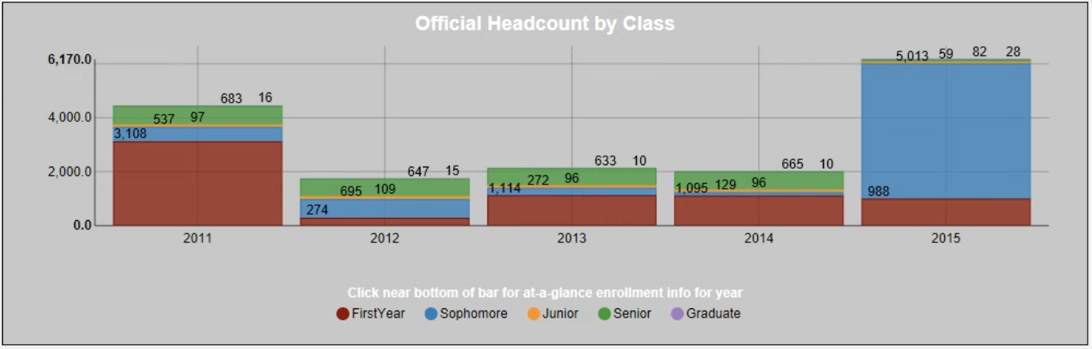
Enrollment Chart

October 27, 2025

Comments

The Chart 

The stacked bar chart shows the official headcount by classification over five years looking at fall semester only. This is useful for answering longitudinal enrollment questions. The stack is the classification, and the bar sections are the years selected.

 
What It Answers 

Start by scanning the top of the bar sections for total enrollment over the years. This will give a good indication that enrollment is on track. Look next at the first-year segment of the bar to see how your new student enrollment is trending.

 
Try it Yourself 

You will need a data series for each classification tracked to aggregate the official headcount. The years can be set by a parameter selection or predetermined. Label the years for easy reading and order the classification so that users can see the bands as they change over time.

Missy Adkison
Senior Professional Services Consultant at Evisions |  + posts

Missy Adkison is a Senior Professional Services Consultant and based in Lehigh Acres, FL. She joined Evisions in January 2022 after retiring as Emerita Data & Intelligence Architect and nearly 28 years at Ball State University in Muncie, IN. During that time, she was the IPEDS Keyholder in IR, MAPS Admin, primary developer, and support for Argos, IntelleCheck, FormFusion, and lead for various other BI and reporting tools while in ITS. Now she can use her understanding of higher education, institutional data, Evisions products and Banner in order to foster client success. She holds a Bachelor of Science in Management Information Systems/ Production Operations Management as well as a Master of Science in Information and Communication Sciences, all from Ball State University. In her free time, she enjoys trying new eateries with her husband, watching a good crime/action show, and spending time with family and friends.

Related Posts

Column Chart – AR Aging

The Chart  This is a column chart that compares open A/R balance by charge category. Use a simple bar when you need to see which categories drive the total. Sort descending, start the axis at zero, and label values in currency.    What It Answers ...

Bar Chart – Admissions Funnel

The Chart  This is a horizontal bar chart that compares counts at each stage of the enrollment funnel. Bars make stage-by-stage gaps easy to scan and are more readable than a classic triangle “funnel.” Use it when you want to see absolute volume at...

Enrollment Chart – Drill through

The Chart  The individual pie charts are created based on a selected year in the enrollment stacked bar chart. The user can drill into the data to learn more about demographic details on gender and full-part time status.   What It Answers  Start by...

0 Comments

0 Comments

Submit a Comment

Your email address will not be published. Required fields are marked *