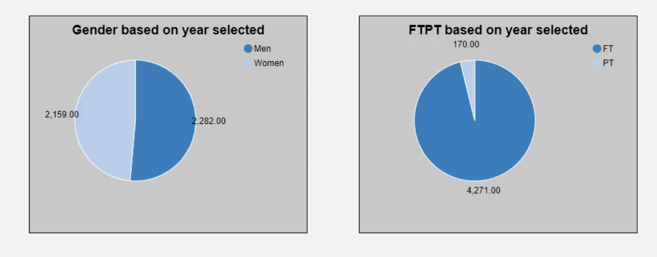
Enrollment Chart – Drill through

November 3, 2025

Comments

Pie charts that highlight changes in gender and full-time and part-time populations.
The Chart 

The individual pie charts are created based on a selected year in the enrollment stacked bar chart. The user can drill into the data to learn more about demographic details on gender and full-part time status.

 
What It Answers 

Start by scanning the sections of the pie chart. This will give a glimpse into a finer grain of data within the year. Look at the next year to compare the demographic section investigated based on the first year selected. This can tell you if your enrollment shifts toward one section over time.

 
Try it Yourself 

You will need a data series for each demographic area to aggregate the official headcount for the year. Label the demographic pie charts to clearly show the year selected. Clearly label the legend and choose contrasting colors for the sections of the pie chart.

Missy Adkison
Senior Professional Services Consultant at Evisions |  + posts

Missy Adkison is a Senior Professional Services Consultant and based in Lehigh Acres, FL. She joined Evisions in January 2022 after retiring as Emerita Data & Intelligence Architect and nearly 28 years at Ball State University in Muncie, IN. During that time, she was the IPEDS Keyholder in IR, MAPS Admin, primary developer, and support for Argos, IntelleCheck, FormFusion, and lead for various other BI and reporting tools while in ITS. Now she can use her understanding of higher education, institutional data, Evisions products and Banner in order to foster client success. She holds a Bachelor of Science in Management Information Systems/ Production Operations Management as well as a Master of Science in Information and Communication Sciences, all from Ball State University. In her free time, she enjoys trying new eateries with her husband, watching a good crime/action show, and spending time with family and friends.

Related Posts

Enrollment Chart

The Chart  The stacked bar chart shows the official headcount by classification over five years looking at fall semester only. This is useful for answering longitudinal enrollment questions. The stack is the classification, and the bar sections are...

Column Chart – Holds by Month

The Chart  This is a column chart showing the count of holds by month. It’s useful when you want to spot seasonal patterns or anomalies in a process quickly. Keep the x-axis in a consistent Month/Year format, include months with zero to preserve...

Pie Chart – Headcount by Age

The Chart  This is a pie chart, useful when you want to show how a small set of categories make up a single whole. Each slice represents a non-overlapping group (age band), so you can see the composition quickly. For readability, keep the number of...

0 Comments

0 Comments

Submit a Comment

Your email address will not be published. Required fields are marked *