Column Chart – AR Aging

November 18, 2025

Comments

Column chart titled “AR Aging” showing open receivables by category.
The Chart 

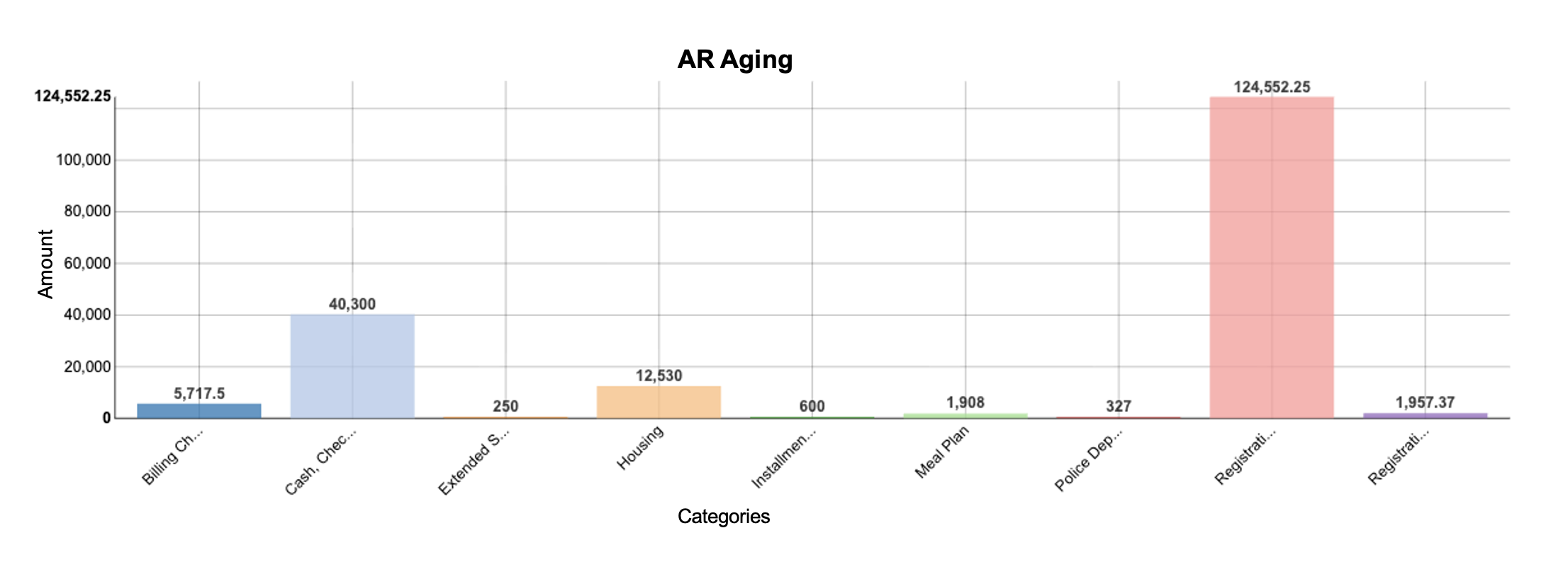
This is a column chart that compares open A/R balance by charge category. Use a simple bar when you need to see which categories drive the total. Sort descending, start the axis at zero, and label values in currency. 

 
What It Answers 

Which receivable category is driving the balance this month, and where should we focus first? 

Read from the tallest bar down. Here, Registration accounts for most of the balance by itself, far outpacing Cash/Checks and Housing. With a focus on registration, verify holds and payment-plan rules, check aid disbursement timing, and run a quick list of top registration accounts to contact. If your goal is collections prioritization, pair this with a 30/60/90/120+ aging slice for registration specifically. 

 
Try it Yourself 

Use student/customer ID, category, open-balance amount, posting date, and as-of date. Filter to open items only (exclude write-offs and fully paid rows), fix the sign convention, and aggregate open balance by category for the same as-of date. Sort bars high to low, format as currency, and add data labels. 

Allen Taylor
Allen Taylor
Senior Solutions Ambassador at Evisions |  + posts

Allen Taylor is a self-proclaimed higher education and data science nerd. He currently serves as a Senior Solutions Ambassador at Evisions and is based out of Pennsylvania. With over 20 years of higher education experience at numerous public, private, small, and large institutions, Allen has successfully lead institution-wide initiatives in areas such as student success, enrollment management, advising, and technology and has presented at national and regional conferences on his experiences. He holds a Bachelor of Science degree in Anthropology from Western Carolina University, a Master of Science degree in College Student Personnel from The University of Tennessee, and is currently pursuing a PhD in Teaching, Learning, and Technology from Lehigh University. When he’s trying to avoid working on his dissertation, you can find him exploring the outdoors, traveling at home and abroad, or in the kitchen trying to coax an even better loaf of bread from the oven.

Related Posts

Bar Chart – Admissions Funnel

The Chart  This is a horizontal bar chart that compares counts at each stage of the enrollment funnel. Bars make stage-by-stage gaps easy to scan and are more readable than a classic triangle “funnel.” Use it when you want to see absolute volume at...

Enrollment Chart – Drill through

The Chart  The individual pie charts are created based on a selected year in the enrollment stacked bar chart. The user can drill into the data to learn more about demographic details on gender and full-part time status.   What It Answers  Start by...

Enrollment Chart

The Chart  The stacked bar chart shows the official headcount by classification over five years looking at fall semester only. This is useful for answering longitudinal enrollment questions. The stack is the classification, and the bar sections are...

0 Comments

0 Comments

Submit a Comment

Your email address will not be published. Required fields are marked *