The Chart
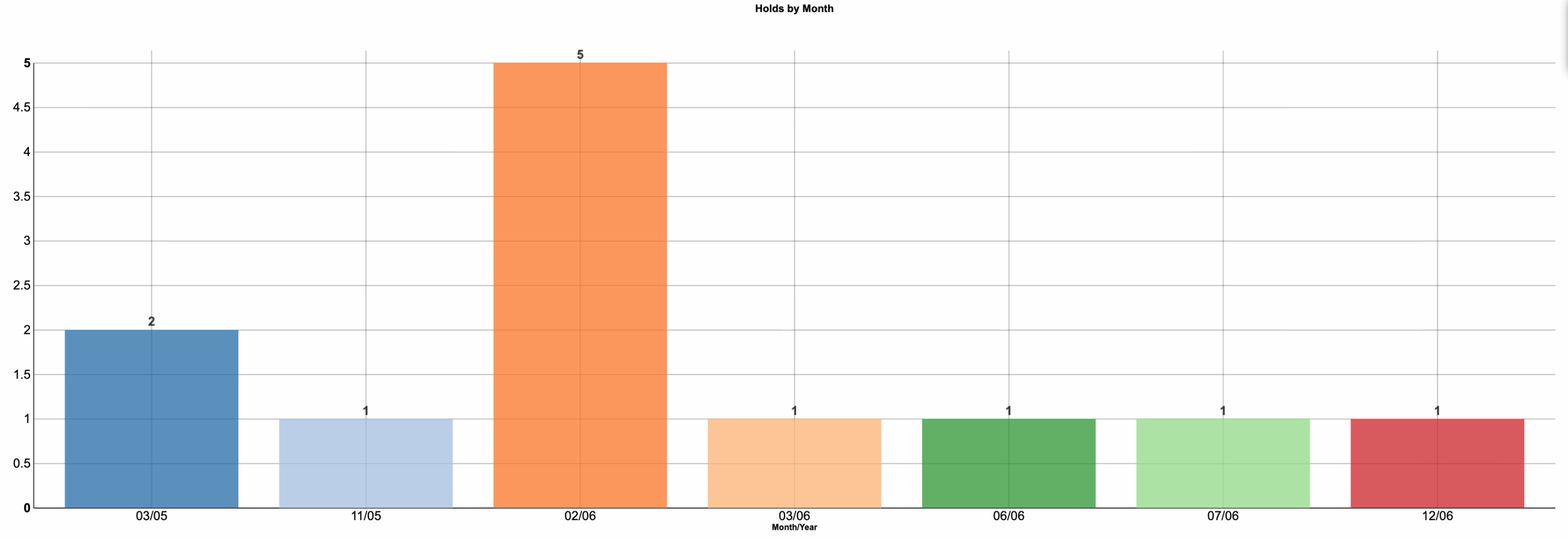
This is a column chart showing the count of holds by month. It’s useful when you want to spot seasonal patterns or anomalies in a process quickly. Keep the x-axis in a consistent Month/Year format, include months with zero to preserve continuity, and use whole-number y-axis ticks so small counts are easy to read. Direct labels on each bar reduce the need to scan the axis.
What It Answers
Do holds cluster in predictable months, and do we need a short-term intervention where they spike?
A quick scan shows an outlier in February 2006 (5), while the rest of the period sits at 1–2. That suggests a time-bound driver, such as a policy deadline, billing cycle, or communications gap, rather than a steadily rising issue. Start by asking what changed that month (new rule, batch job, staffing) and whether the event recurs annually. A common pitfall is overreacting to small-n volatility; confirm the window represents a full year and consider whether a single busy week created the spike.
Try it Yourself
Use the hold start date and student ID as a key. Bin by month/year on the start date, making sure to show months with zero for continuity. Count distinct holds per month, label values on the bars, and cap the y-axis to a sensible maximum, so small differences are visible.


0 Comments