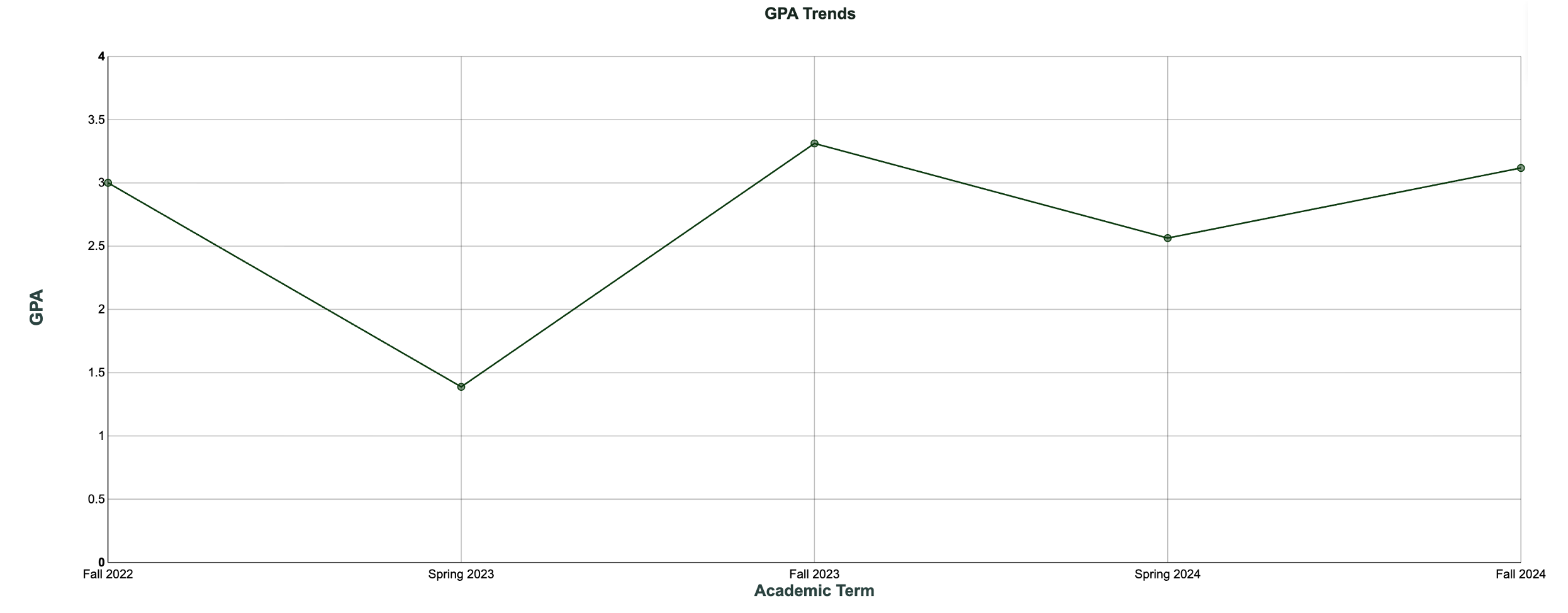
Line Chart – GPA Trends

December 8, 2025

Comments

Line chart titled “GPA Trends” for one student across five terms: GPA is 3.0 in Fall 2022, drops to 1.4 in Spring 2023, rises to 3.3 in Fall 2023, dips to about 2.6 in Spring 2024, then climbs to just over 3.1 in Fall 2024.
The Chart 

This is a line chart showing one student’s term GPA over time. Each point is that student’s GPA for a given term, and the line connects the points, so you can see the pattern across semesters instead of treating each term as an isolated result. For advisors, this kind of simple line is helpful because it visually separates “a rough term” from “a consistent downward slide,” which can change the kind of conversation you have with the student. 

 
What It Answers 

Is this student experiencing repeat spring term struggles that should shape our advising and support plan? 

Read left to right and look for the shape of the line. Here, the student starts at a solid 3.0 in Fall 2022, drops sharply to 1.4 in Spring 2023, rebounds strongly to 3.3 in Fall 2023, dips again in Spring 2024, and recovers to just over 3.1 in Fall 2024. The pattern is not random. Fall terms are strong, and spring terms are weaker. In an advising meeting, this suggests targeted questions about what changes in spring: course load, work hours, health, or family responsibilities.  

 
Try it Yourself 

To build this view, start with a student-term dataset that includes student ID, term, and term GPA. Filter to one student and sort the terms chronologically. Create a line chart of term GPA by term, keep the y axis consistent with your grading scale (for example 0.0 to 4.0), and add data labels on each point.  

Allen Taylor
Allen Taylor
Senior Solutions Ambassador at Evisions

Allen Taylor is a self-proclaimed higher education and data science nerd. He currently serves as a Senior Solutions Ambassador at Evisions and is based out of Pennsylvania. With over 20 years of higher education experience at numerous public, private, small, and large institutions, Allen has successfully lead institution-wide initiatives in areas such as student success, enrollment management, advising, and technology and has presented at national and regional conferences on his experiences. He holds a Bachelor of Science degree in Anthropology from Western Carolina University, a Master of Science degree in College Student Personnel from The University of Tennessee, and is currently pursuing a PhD in Teaching, Learning, and Technology from Lehigh University. When he’s trying to avoid working on his dissertation, you can find him exploring the outdoors, traveling at home and abroad, or in the kitchen trying to coax an even better loaf of bread from the oven.

Related Posts

Pie Chart – Head County by Race/Ethnicity

The Chart  This is a pie chart, which is useful when you want to show how a whole population is divided among a small number of categories at one point in time. Each slice represents an ethnicity category, and the size of the slice shows how many...

Column Chart – AR Aging

The Chart  This is a column chart that compares open A/R balance by charge category. Use a simple bar when you need to see which categories drive the total. Sort descending, start the axis at zero, and label values in currency.    What It Answers ...

Bar Chart – Admissions Funnel

The Chart  This is a horizontal bar chart that compares counts at each stage of the enrollment funnel. Bars make stage-by-stage gaps easy to scan and are more readable than a classic triangle “funnel.” Use it when you want to see absolute volume at...

0 Comments

0 Comments

Submit a Comment

Your email address will not be published. Required fields are marked *