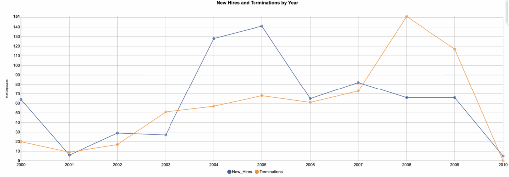
The Chart
This is a two-series line chart, which is good choice when you want to show how things change over time. Each line traces annual counts for one measure (here, new hires and terminations), so you can see direction, pace, and where the curves cross.
What It Answers
Is our institution in net hiring or net loss each year, and when does that balance shift?
Start by scanning for crossovers; those years mark a move from net growth to net loss (or the reverse). Look next at the steepness of each segment to spot surges or slowdowns. Because lines can be noisy year to year, annotate the first crossover and the steepest rise or fall to anchor the story. If your goal is to judge net change at a glance, add a small bar below the lines that shows hires minus terminations, or switch to a single net bar chart for a simpler read.
Try it Yourself
You only need a year, a count of new hires, and a count of terminations. Aggregate to one row per year, plot both series on the same y-axis starting at zero, and label the crossover year directly on the chart so readers do not have to hunt.


0 Comments