
The Chart
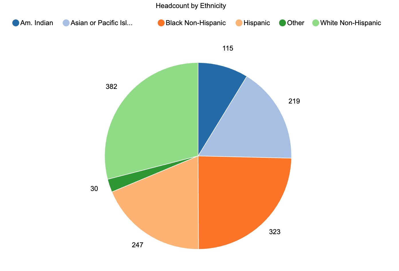
This is a pie chart, which is useful when you want to show how a whole population is divided among a small number of categories at one point in time. Each slice represents an ethnicity category, and the size of the slice shows how many students fall into that group. This version uses raw counts as labels rather than percentages, which keeps the focus on how many students are in each group while still conveying their relative share of the whole.
What It Answers
What is our current enrollment mix by race and ethnicity, and which groups make up the largest and smallest portions of our student body?
Start by finding the largest slice to anchor your eye. Here, White Non-Hispanic students make up the largest group, followed by Black Non-Hispanic, Hispanic, and Asian or Pacific Islander students. The American Indian and “Other” categories are much smaller. A pie chart like this is most helpful when you are answering a “composition” question for a single term. A common pitfall is trying to compare many categories or multiple terms in a single pie. If you need to compare ethnic composition across years or between programs, a bar chart will be easier to read than a series of pies.
Try it Yourself
To build this view, you only need a student-level table with at least two fields: a census term and an ethnicity category. Filter to your census snapshot for the term you care about, group by ethnicity, and count distinct students in each category. If you have many very small groups, combine them into an “Other” category so the chart stays readable and apply your small-n rule to protect privacy. Then create a pie chart of headcount by ethnicity, sort the legend in a logical order, and label each slice with the count (and optionally the percentage) so that anyone in the room can read the chart without doing mental math.


0 Comments
0 Comments