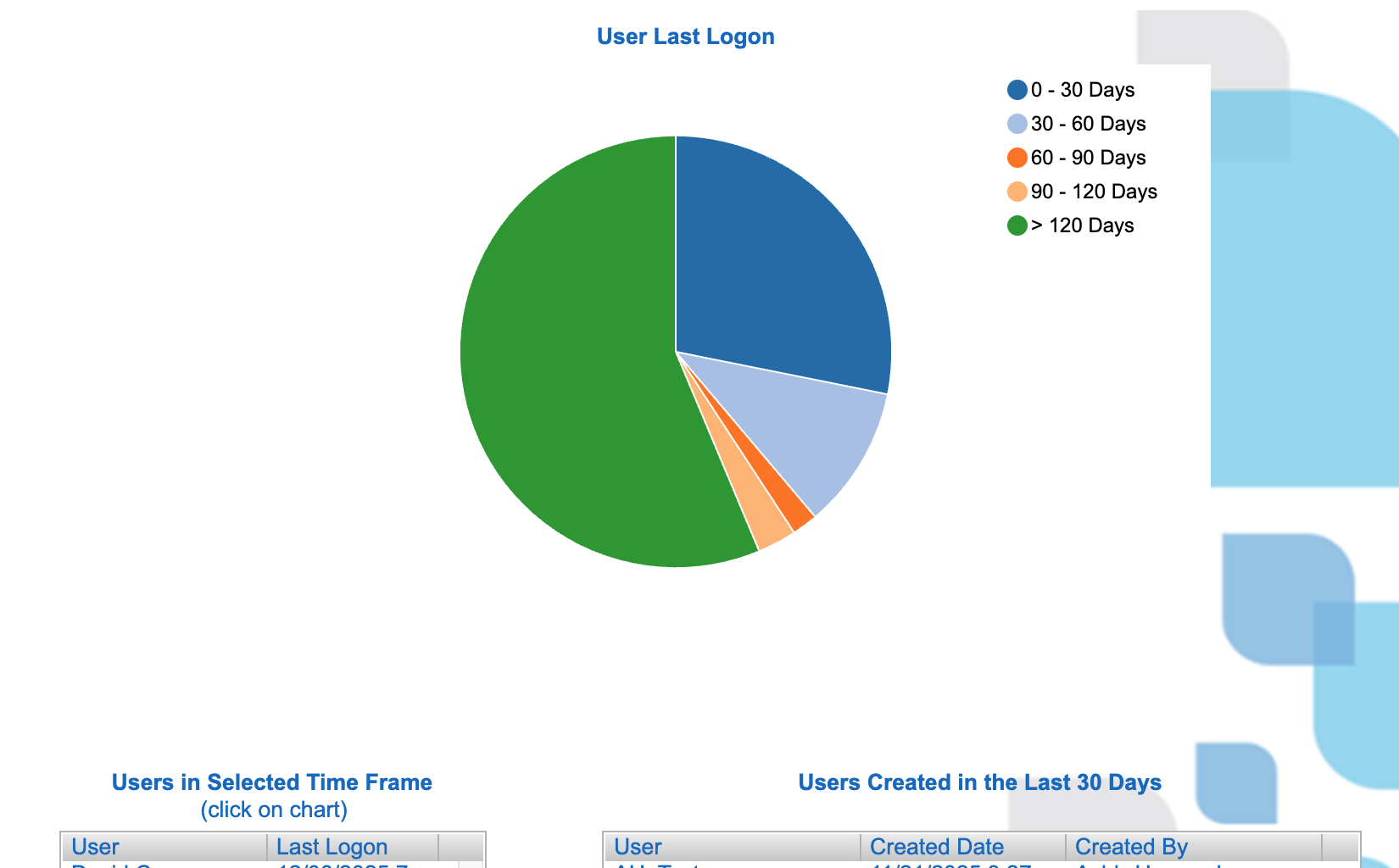

The Chart
This is a pie chart showing how your user population breaks down by last logon recency. A pie works here because you are answering a composition question at a single point in time: how much of our user base is active versus inactive.
What It Answers
Do we have an adoption problem, an access hygiene problem, or both?
In this view, the 120+ days slice dominates, which is a signal that a large portion of accounts are effectively dormant. That might be totally reasonable if access is granted broadly and only needed seasonally, but it can also mean you are carrying old accounts, duplicative accounts, or “just in case” access that creates noise for support and risk for security.
Try it Yourself
Start with a user-level dataset that includes user ID, last logon date, and created date. Calculate days since last logon, bucket users into a small set of ranges like the ones shown here, then count users per bucket and build the pie chart from those counts. Add an interactive table that lists user and last logon and configure it so selecting a slice filters the table.
We hope you’ve enjoyed learning with our One Chart, One Decision series this semester! We’re taking a short break for the holidays, but we’ll be back in January sharing more great visualizations that help you answer real questions with data. Best wishes for a happy and restful holiday season!


0 Comments