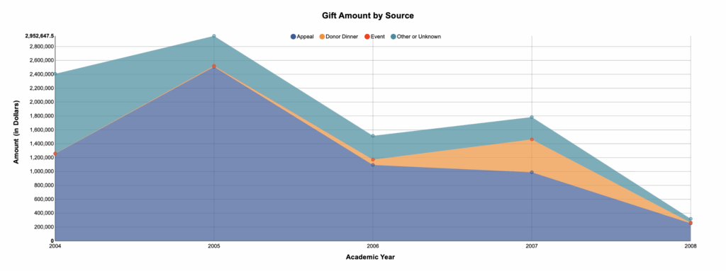
The Chart
This is a stacked area chart, which is useful when you want to see both the total amount of a variable and the mix inside that total over time. Each band represents a source (Appeal, Donor Dinner, Event, and Other/Unknown), so you can read both volume (overall height) and composition (band thickness) by year.
What It Answers
Are we overly dependent on one source, and where should we shift effort next year?
Start by scanning the overall height to spot peaks and dips in total giving. Then look at each band’s thickness to see how the portfolio mix changes. In this view, Appeals carry most of the total, peak around 2005, and trend down afterward. Donor Dinner shows a one-year spike in 2007 before dropping. A common pitfall is that stacking can hide the exact trend of a single source. If your goal is to compare sources across years, try a 100% stacked version to emphasize share changes.
Try it Yourself
You only need Academic Year, Gift Source, and Gift Amount. Aggregate to year × source, stack the sources in a consistent order, and start the axis at zero. Label either totals or % share on each year. For a quick variation, duplicate the view as 100% stacked to discuss the mix before you talk tactics or discuss future planning.


0 Comments