The difference between an art museum and an art gallery is subtle. Museums showcase art for the art enthusiast – for interest, critique or discussion. Museums tend to be grandiose, containing all types of art, separated by theme or artist. While art galleries also showcase art, their purpose is to create interest and promote or sell the artwork. Furthermore, galleries usually specialize in small exhibits focused on a particular artist or a common medium.
A dashboard can be likened to an art gallery – a data gallery, so to speak. The data is the art, and the objective of the dashboard is to showcase or ‘sell’ the data to the user. The focus is typically a subset of data for a limited audience (executives, directors, deans, faculty, students or others) with a pre-determined purpose, such as decision support, institutional research, trend analysis, or performance management.
An art gallery must be designed to create an environment with enough visual interest to draw in the viewer, but without distracting from the art itself. Such is the design of the dashboard and its main attraction, the data.
Relational Design
The design of an art gallery requires planning to make the best use of space, flow, and grouping. The gallery should intentionally guide the customer to and through the artwork.
In dashboards, relational design shows the association between, and the importance of, one set of data or objects over another. This can be accomplished by paying close attention to placement and organization.
Placement
Some dashboards allow users to select parameters in objects such as dropdown lists, list boxes, radio buttons, and checkboxes. The parameter values selected by the user filter data results and the placement of parameter objects indicates what is controlled by the filter.
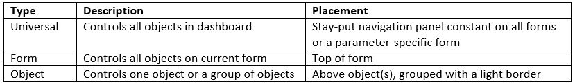
Proximity and similarity play important roles in how the relationship between objects and data is perceived by the user. Therefore, related items should be spaced closer to each other, or grouped together using objects like panels, borders or shapes.

For additional information on placement philosophy, research ‘Gestalt Design Principles’.
Organization
A well-organized dashboard allows the user to find pertinent information quickly. Organization dictates navigation, and utilizing the tips below will maximize the efficiency of the dashboard.
Position data and objects strategically – with the most important or most broad at the top. As well, on a multiple-form dashboard, the content of each subsequent display should be more specific than the prior one.

Be aware of empty space (aka white space or negative space). If empty space doesn’t appear intentional, it can become an eye-sore and steal the focus from the data. Yet, empty space can help group similar data objects to assist with readability, but be sure the empty space between similar objects is consistent and small. To minimize random empty space, align all objects to another object. All charts, headings, logos, panels, buttons and labels should be aligned to something else.
Limit static text, especially for instructions. After all, once users know how to use the dashboard, the text is useless and takes up space. To minimize text, make any help instructions accessible via a button. Another idea is to include roll-over hints or descriptions for each parameter object.
Finally, pay attention to margins and the overall size of your dashboard. How will it be viewed? Knowing if the audience plans on viewing it on a laptop, desktop, tablet or projector will help determine the dimensions. If the output medium is unknown, the safest size is 800 x 600. Once the dashboard is complete, test on different devices to see how each might affect the design.
Decorative Design
In an art gallery, the lighting and décor are selected to draw interest to the artwork. The goal is to create an appealing visual display that intrigues the patron, complements the art, and encourages a connection between the two.
The basic definition of a dashboard is a graphic, easy-to-read representation of data. Charts usually pull the heavy load in the graphic representation of data. In addition, using the correct font and colors to add visual interest will assist in making the dashboard easy to read. Like the lighting and décor in the art gallery, the decorative design of the ‘data gallery’ will initiate the connection between user and data.
Fonts
The best practice in printed material design is to use two fonts – one for headings/titles and one for body text. When it comes to dashboards, the design practice is similar, but there’s a third element to consider – the data itself.
Headings and static text can utilize the same font in varied sizes or distinctive styles (bold, plain, italic, underline), or two different fonts from the same font family (serif, sans-serif).
The opposite font family should be used when presenting data objects such as list boxes. This practice helps differentiate actual data from the static text and headings in the dashboard.
Other considerations for font usage include:
- Use professional fonts. Script or decorative fonts take emphasis away from the data, and aren’t applicable in all browsers.
- Keep an eye on your font sizes. The standard size font for online use is 12 for Times New Roman and 10 for Arial.
- Watch for inappropriate line breaks and orphans (one word on the last line).
- Adjust line spacing, justification and contrast as needed, for direct, yet minimal effect.
- Keep line length appropriate for maximum user attention. The formula is font size x 2.
Colors
Painting a beautiful mural on the wall in an art gallery detracts from the goal of the gallery – to showcase and promote the art. Similarly, using the full spectrum of rainbow colors for fonts and backgrounds will distract the user from the focus of the dashboard.
Different philosophies exist on the use of color in dashboard design. The one rule everyone agrees on is to keep it minimal.

Consider these guidelines when using color:
- Create a color scheme using the color wheel, with 4 or less colors.
- Add shading and highlighting using gray scale colors.
- Treat white as a color, not a background or default color.
- Desaturated colors come across as professional.
- Saturated colors can appear childish, but can be used sparingly to grab attention.
Most of all, know your audience when selecting colors. If the dashboard is multi-cultural or public, do research on how different people and cultures respond to colors. (Additional information on colors in culture can be found here.)
Summary
A piece of art hung on a blank wall near a busy intersection might garner interest from a few passersby. But that same piece of art showcased in a beautifully designed art gallery will be appreciated and promoted and eventually sold to the intended audience.
Hence, the fate or future of data. Designing a ‘data gallery’ requires planning and consideration, but the successfully understood and utilized dashboard is well worth the effort.


I’d be interested to hear your thoughts on using Argos with keeping ADA Compliance using WCAG 2.0 Level AA guidelines. This might make a good topic for a future Blog.
Hi Michael,
I’ll pass your idea along to some folks here at Evisions and see what we can do. Thanks!
Eric Goldman
Sr. Marketing Associate
Evisions
Good news, Michael. It looks like we’ll able to do a blog on ADA Compliance in Argos, as you proposed. However, we likely won’t be able to get to it until September or October. So keep an eye out! 🙂
Thank you for the suggestion, and for reading the Evisions blog!
Eric
Hi Michael,
I hope you saw that our Argos Accessibility blog is now out: https://evisions.com/improving-accessibility-argos-dashboards/
Thank you again for the suggestion!
Eric