You’re tasked with creating a report for a set of data. The goal is to create a report your audience can quickly and easily understand, so they can use it to make key business decisions. You look at the data and see that it contains rows and rows of information. What is the best way to showcase the data for your audience?
As in all projects, you’ve got limited time to decide how the data should be formatted and how it will look its best. You decide that a table is the best option for presenting a summary of the data. But, do you use a simple table or a pivot table?
Simple Tables
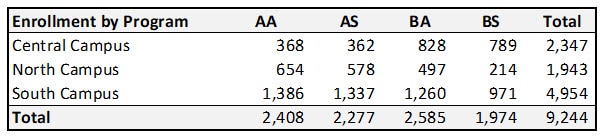
When to Use a Simple Table
A simple table should be used when the data set is small, since the data is shown in a list form. A table layout provides your audience with the ability to look up individual values and see one-to-one comparisons. It also allows you to sort, filter, and sum the data to present it in a logical form. You can then add formatting to improve the visual understanding.
Best Practices for Simple Tables
- Organize the data in a sequence, or in groups, based on how it makes sense for the data. If you are not sure about the grouping, think about your audience and how they’ll view the data. You can add a filter to your columns to help set the order. If you’re including a ratio (for showing a percentage increase or decrease) it should come right after the raw data that feeds the ratio. If you’re showing aggregated values, you should visually separate the data using borders and colors.
- Emphasize the data by using simple borders and grids to achieve a clean layout. This includes paying attention to the formatting and colors of the header row. (Tip: try a white font color with the header row itself shaded a darker color.)
- Determine the formatting based on the data. Right-align numbers so your reader can easily understand and compare the values. Left-align your text to make it easy to read. If the text is short, you can center align the values. Use simple fonts to make it easy for your audience.
- Keep the readers focused by using bold to bring attention to certain numbers or text. You can use color to show negative values when needed. The use of symbols is a good choice when the data contains comparisons.
Remember to keep it basic. Don’t overdue formatting, colors, and the use of symbols. Only use extra formatting when you need to call attention to the data. Make it straightforward for your audience. They need to understand the data to help them make data-informed decisions quickly and easily.
Potential Issues with Simple Tables
Once the size of the dataset grows, it can become difficult to maintain formulas and manually update the formatting to accurately represent the data. Once the data grows past a single page view, it is difficult to see a summary of the data. When this happens, the basic formatting may represent the data incorrectly and cause your audience to question the data.
Pivot Tables
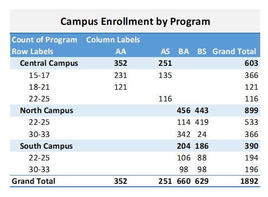
When to Use a Pivot Table
A pivot table is a great choice once the dataset size grows beyond a simple list. It provides an automated way to quickly condense large amounts of data in matter of seconds. A pivot is a great way to see more complex data organized in a simple view. The pivot layout helps you make important data clear and meaningful to your audience.
Best Practices for Pivot Tables
- Organize the data into rows and columns. You’ll need one row for each record. The data shouldn’t include any empty rows or columns. You’ll need to ensure you have single-row text for the column headings to ensure the text is easy to understand once it’s shown in the pivot.
- Once you’ve selected any cell in your source data and created the pivot, you can now build out your pivot by adding the fields to the three different areas. (Tip: most software includes a list of suggested pivots based on the data.) Move the data into the Rows, Columns, and Values fields to get a view of the data. You can change the design of the pivot by adding and arranging fields in each section. By default, the non-numeric fields go in the Rows section and numeric fields go into the Column and Values section. The Values area is used to summarize numeric values and provide totals.
- Group and ungroup the data to show a subset of data for analysis. Grouping data is helpful when you want to show a complete result, such as each year in a series. The grouped data can include a subset of each month based on the actual dates in the data. You can collapse a subset when needing to see just a quick summary.
- Determine the best layout for the data. Will your audience understand the data better in a pivot table or pivot chart layout? Your first selection will probably be a pivot table, but not everyone can look at numbers in a table and quickly understand what is going on. A pivot chart is connected to the pivot table and is a visual representation of the data. Think about showing a pivot table and chart together to better showcase the data and improve the likelihood of understanding.
Modifying the Pivot Table
Once you have the data in the right places, you can give your pivot a different style. Most software applications provide a style selection to change colors, borders, and text options to improve the visual layout of the data. Browse through the options and select one that meets your requirements - but remember to keep it simple.
(Tip: when you first start using a pivot table, you’ll see errors in the data that need to be corrected. Once you add to or change your source data, you’ll need to refresh the data in your pivot table.)
Replacing Blank Cells
Having blank cells in your pivot table can lead to assumptions. Is the cell blank because the source data is invalid or is the blank cell intentional? An easy way to solve this is to set a value for the blank cell. You can change the field to show a zero or “N/A” instead of being blank. (Tip: disable the items with no data from showing up in the pivot.)
Changing the Sort Order
By default, the order of the data in the pivot table is usually the same as that of the source data. You can then change the order to alphabetical (A to Z), ascending, or descending.
Other Tables
Simple and pivot tables are not the only options available. They are just the most commonly known and used. Other table types (alternate table names) include:
- variable data
- multi-dimensional
- cross-reference
- logical
Of course, if you’re familiar with Evisions Argos, you also know that its OLAP Cubes feature enables users to independently arrange and filter data by dragging and dropping their desired information into the cube. (Think pivot table on steroids!)
Conclusion
When choosing between a simple or pivot table to display your data, remember to keep both the data itself and your audience in mind. A simple table is useful when the data set is small, but it can also be difficult to maintain and use for drawing conclusions. When the dataset is larger, leveraging a pivot table to simplify and summarize the data is probably the better way to go.
Simple tables and pivot tables are both powerful tools for showcasing data. Just remember to keep these best practices in mind. It will benefit both you, the report creator, and your audience, the report reader.


0 Comments