All departments within an institution of higher education have numerous sources and insane amounts of data. They utilize these sources and data to track and forecast institutional performance. The departments are responsible for planning, developing, governing, and managing their data-rich systems. Still, it can be challenging for individuals within these departments to effectively communicate the data to their administrative leaders for decision making.
Not too long ago, having data visualization skills was a “nice-to-have” asset for institutional data leaders. This is no longer the case. Data leaders within institutions are now expected to take on the additional role of the data visualization designer.
New tools and technologies have emerged to assist data leaders with the flexibility to synthesize complex data sets from scratch in a non-technical manner. However, they don't automatically make your data leaders effective data visualization designers. The following are common “must-haves,” “shouldn't-haves,” and a “nice-to-have” that can help create accurate and compelling data visualizations for your institution.
Must-haves
Team Effort
Before visualizing any data, create a data visualization team. The team should consist of:
- Subject matter experts who know the context of what stories the data will tell
- Users who are trained in the tools and technologies required
- Data visualization designers who can provide graphic design expertise for creating visualizations and dashboards
The perspectives, knowledge, and skillsets brought by the various team members all play equal parts in designing data visualizations.
Target Audience
Like any good marketer will tell you: know your audience! Understand the context of what the data will uncover. It needs to be clear! (The most eye-pleasing visualization will be meaningless if it doesn’t clearly answer a specific question.) Use storytelling when talking amongst the team and when sketching out the framework to communicate the information uncovered by the data. Add a compelling narrative to put your data visualization into perspective before you begin processing the data.
Shouldn’t-haves
Complexity
Avoid graphs and charts that are complex. Instead, take the approach where less is more. Keep the visualizations simple. Effective data visualizations minimize the use of colors, or other attributes, that might distract the viewer from the purpose of the data visualization.
Signs that your visualization includes too much information could include:
- The chart is so crowded that it’s difficult to differentiate data points quickly
- Multiple text boxes are required to explain the data points
- Your visualizations exceed more than six colors
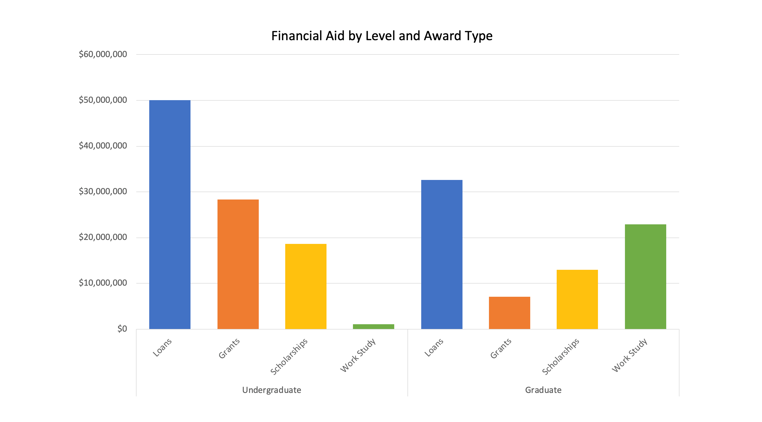
Bar charts, line charts, scatter plots, dot plots, and tables are effective in grabbing the data consumer’s attention. And each should be able to make their points to the reader within 10 seconds.
While this bar chart might seem to work…
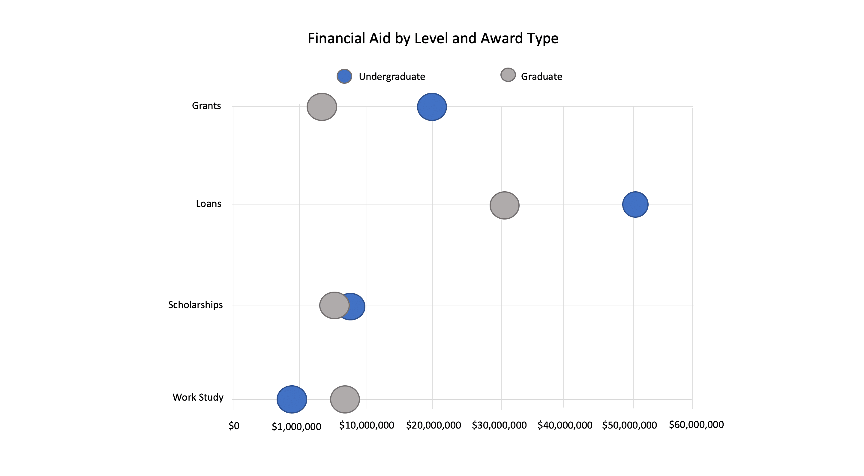
…this dot plot is actually a cleaner representation of the data.
Lots of Colors
To help get your point across, limit the number of colors used in your data visualizations to reduce distractions. (As mentioned above, six colors should be the max.)
When performing comparisons on your data, use shades of the same color. Colors should draw the data consumer’s eye to the data points that are important. You can then use shades of grey for those data points meant to be in the background and not the focus of the data story.
Misrepresentation of Data
Whether it’s intentional or unintentional, a visualization could misrepresent the data and end up misleading the data consumer. So, be sure to avoid the following so that the data set is not questioned:
- Using uneven intervals between numbers
- Inaccurate scales when comparing sizes
- Disproportional space in relation to corresponding percentages
Nice-to-have
Review Panel
If possible, utilize an external review panel to ensure the data visualization stories are understood. Among the items the panel should check are:
- The graphs are to scale
- The data adds up to the total
- The labels are accurate
The panel should check – and then double check – these elements to verify that the data visualizations are complete.
Easy as Pie…?
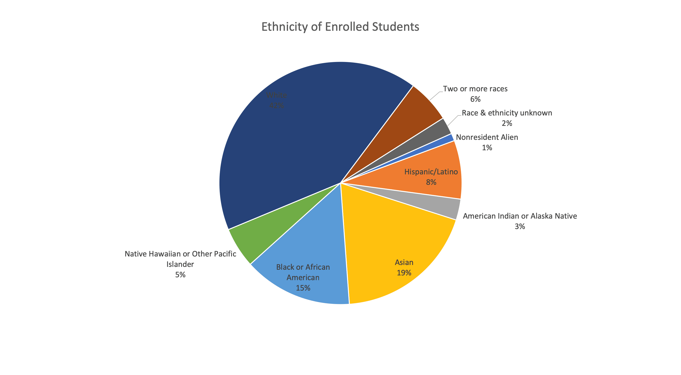
Because the use, and misuse, of pie charts in data visualization is so common, I felt I needed to address these types of displays separately.
When communicating data stories about parts-of-a-whole, data designers will often consider pie charts. If they are dealing with four data points or less to communicate, a pie chart should definitely be considered. This is because the data consumer's eye can easily compare the areas of the pie chart. However, if more than four data points are being communicated on a pie chart, it's extremely difficult for the data consumer's eye to differentiate the various “slices” of the pie.
Here’s an example of a pie chart with too many data points:
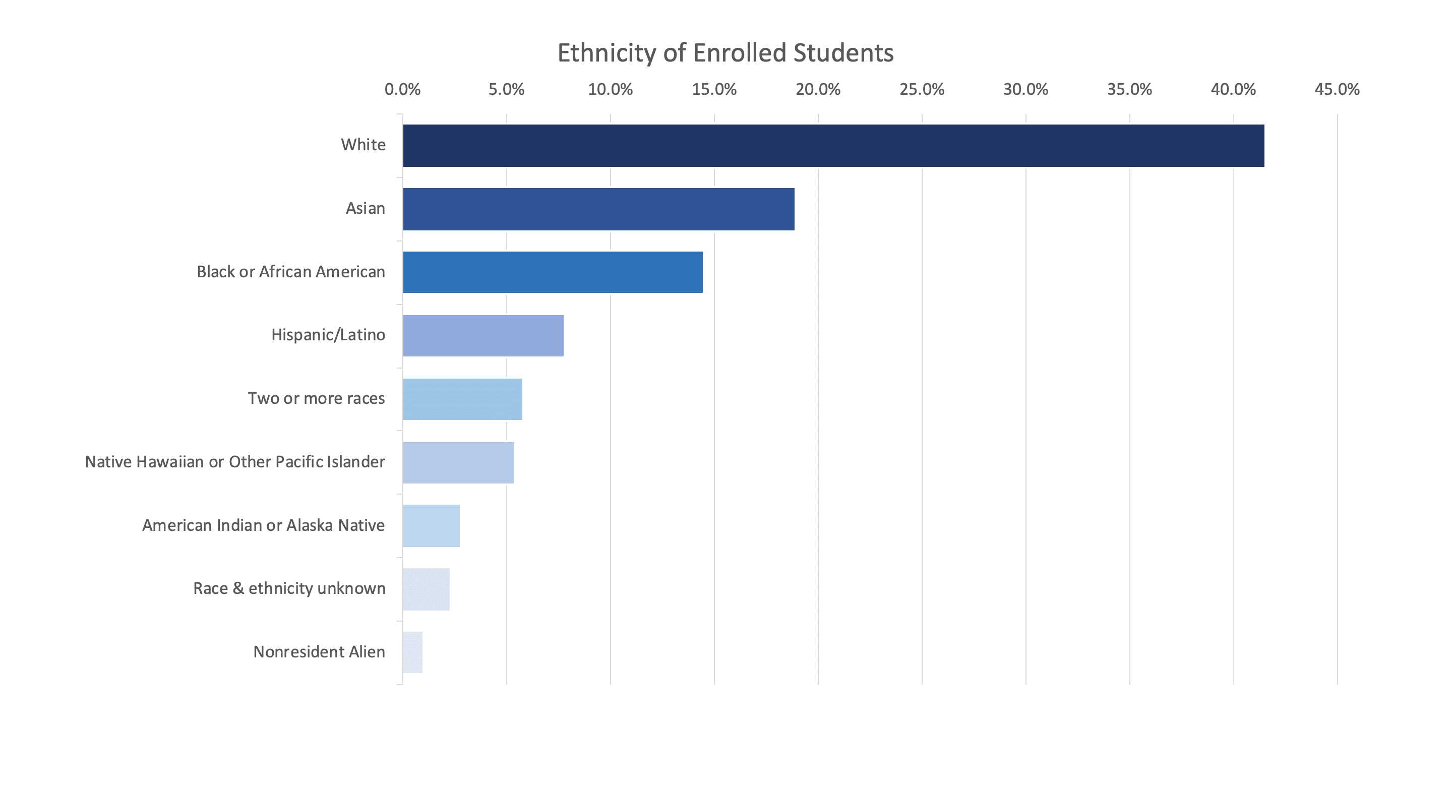
The data in the pie chart above can be better represented in this bar chart:
Conclusion
If you’re not confident in your visualization capabilities, don’t fret. Remember, we all think visually (or at least have the capacity to learn to think visually).
In higher education, we tend to be surrounded by data visualizations every day. So, take notice of the visualizations you see. Try to understand what makes them good (or what makes them bad). Before becoming fantastic data visualization designers, we must first become equally fantastic data consumers!


0 Comments