We’re excited to launch our first post in our new One Chart, One Decision series. Each week, we’ll feature a new visualization, unpacking it in 250 words or less in three sections.
- The Chart – We’ll tell you what type of visualization it is and why it fits our use case. Then, we’ll describe what the data the chart is displaying.
- What It Answers – a description of what question(s) the chart is answering and how to read. We’ll also discuss some common pitfalls to avoid.
- Try It Yourself – a brief set of instructions on how to construct this chart to try it yourself!
As always, if you have questions about the chart, what it’s for, or how to make it, let us know in the comments below. Now, on to the first chart!
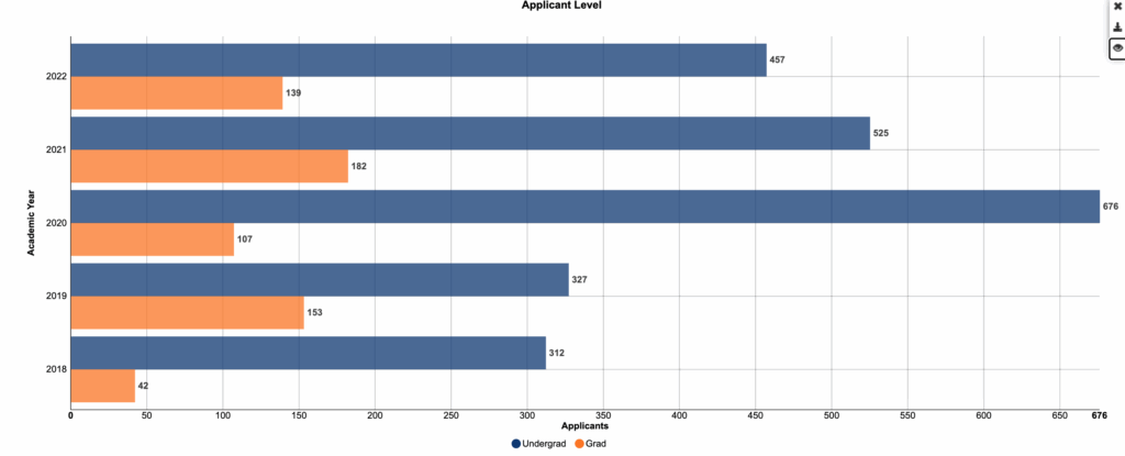
The Chart
This is a clustered or compound horizontal bar chart, which works well when you want to see total volume and composition together for each category (here, academic year). Each bar shows the year’s total applicants, split into Undergrad and Grad segments.
What It Answers
Is the graduate share growing, and do we need to rebalance recruiting effort between levels next cycle?
Start by reading total bar length to understand volume, then look at the relative size of each segment to spot composition changes across years. One common pitfall is that stacking can hide level-specific trends over time; if your goal is to compare undergraduate and graduate patterns year over year, a grouped bar chart or two small line charts will often be clearer. If totals swing a lot by year, a 100% stacked version can make share changes easier to see.
Try it Yourself
You only need academic year, level (undergraduate or graduate), and applicant counts. Aggregate to year and level, create the stacked bars, sort by year, start the axis at zero, and label either the total or the percentage share on each bar. For a quick variation, sort by total applicants to highlight the peak years and annotate the first year where the graduate share changes direction.


0 Comments
0 Comments